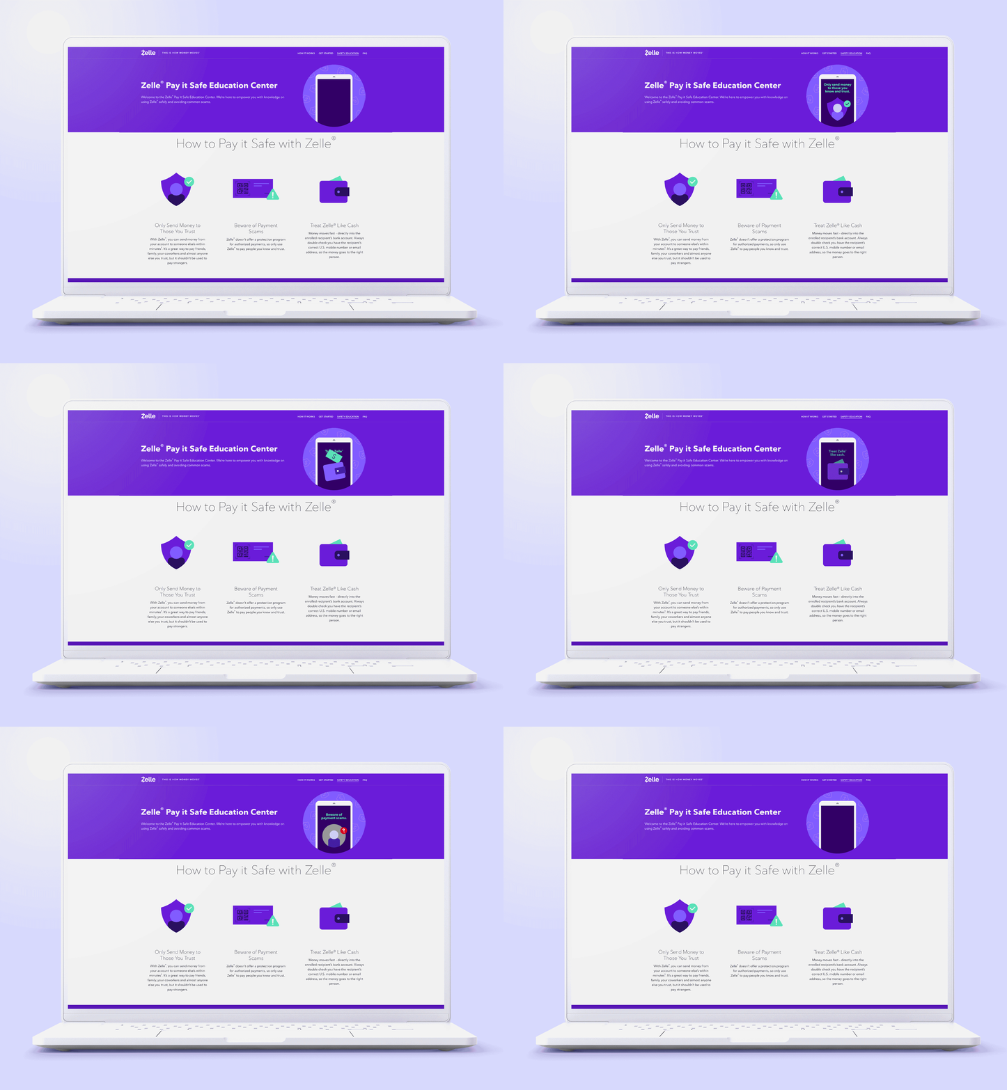
Zelle: Pay it safe
Role: Brand Design Lead & Creative Director
Motion Graphics Partner: Epipheo
Overview
As Creative Lead, I helped shape and execute Zelle’s “Pay It Safe” campaign—an educational initiative focused on fraud prevention, consumer empowerment, and digital trust. This multi-channel effort included animated explainer videos, web and print materials, and downloadable toolkits distributed across Zelle’s network of 2,500+ financial institution partners. The campaign was designed to meet consumers where they are, offering clear, actionable safety guidance in an approachable and brand-right tone.
Built in collaboration with internal stakeholders across compliance, legal, and partner marketing, the campaign became a cornerstone of Zelle’s broader brand education efforts—playing a vital role in strengthening public trust and platform confidence
My Role & Collaboration
As Creative Lead, I shaped the campaign across mediums—directing the educational video series while also designing key web and print assets. I collaborated closely with internal stakeholders across compliance, legal, and partner marketing, ensuring that every deliverable struck the right balance between clarity, trust, and brand voice.
For the video series, I guided tone, scripting, visual language, and production alongside external animation partners. On the design side, I took a hands-on role, crafting toolkits and templates for use by Zelle’s network of 2,500+ financial institution partners.
My work was especially focused on communicating to less digitally native audiences. The goal wasn’t just to inform, but to demystify digital payments and empower users to move money confidently and securely.
Creative Brief / Strategy
The Challenge:
Despite Zelle’s rapid growth, research showed that many users—particularly older or less digitally native consumers—lacked confidence in using digital payments safely. Misinformation and low awareness of basic security practices posed significant barriers to adoption and trust.
Strategic Insight:
Trust isn’t built through fear—it’s built through clarity, relatability, and repetition. We needed to position Zelle not just as a fast and convenient way to send money, but as a trusted guide in the digital payments space. Our messaging focused on demystifying safe usage practices in an inviting and non-patronizing tone.
Audience Focus:
The campaign targeted users who were active or interested in using Zelle but needed support in understanding how to use it safely—especially older generations, first-time users, and risk-conscious consumers.
Key Message:
Pay it safe. Zelle is safe to use—when used wisely. The campaign emphasized three core behaviors: Only send to people you know and trust, Verify recipient details, and Treat Zelle like cash.
Creative Approach:
We opted for a warm, simple, and illustrative visual language that felt clear and reassuring without being dull. Messaging was kept short and memorable, with repeated reinforcement of safety best practices across mediums and platforms.
Creative Process & Execution
This was a multi-pronged educational campaign executed across video, web, and print to maximize reach and clarity. I led the creative direction for the educational video series, collaborating with a production agency to develop simple, story-driven animations. Each spot introduced a real-life scenario—like splitting the cost of a gift or paying a neighbor—and embedded a single, clear safety takeaway.
I was deeply involved in scripting, storyboarding, casting, visual design, and review cycles. Given the importance of accuracy and tone, I worked closely with legal, compliance, and brand stakeholders to align each detail while protecting creative clarity.
In parallel, I acted as the hands-on designer for all supporting assets, which included downloadable PDFs, printed infographics, social cutdowns, email templates, and landing pages—all translated for use across Zelle’s 2,500+ financial institution partners. I built flexible, modular templates that internal teams and partner institutions could easily adopt while preserving visual consistency and core messaging.
Design elements prioritized warmth, readability, and clear iconography—reducing friction and increasing message retention across a range of user touchpoints.
Results & Impact
The Pay It Safe campaign became a foundational pillar of Zelle’s consumer education efforts—delivering critical safety messaging at scale, with clarity and consistency. By pairing relatable scenarios with easy-to-follow guidance, the campaign helped demystify digital payments and build user confidence.
Educational videos were syndicated across digital platforms, financial institution portals, and in-branch experiences. Partner institutions used the assets extensively, tailoring content to their own customer bases while maintaining consistent messaging.
In tandem with the 2023 National Campaign, Pay It Safe helped drive record-breaking engagement for Zelle. According to Digital Transactions, Zelle posted a 32% year-over-year increase in consumer enrollments and a 29% increase in payment volume in the first half of 2024—growth fueled in part by stronger consumer trust and improved platform understanding.
Internally, the campaign has also served as a model for future educational initiatives—proving the value of design-led storytelling in regulated, high-stakes environments.

Reflection
The Pay It Safe campaign reflects the unique power of design to shift perception and build trust—especially in industries like fintech, where user confidence is everything. Guiding this initiative allowed me to blend strategic direction with hands-on design, and to collaborate across legal, compliance, education, and marketing in a highly visible, high-stakes space.One of the most rewarding aspects was designing with empathy: considering not just what needed to be communicated, but how and where users would encounter it. From video to print to web, the challenge wasn’t just to inform—but to empower.
As Zelle continues to scale, Pay It Safe has become a key part of its brand story—proving that safety education, when treated as a creative opportunity rather than a constraint, can be both beautiful and effective.


